
Okay, weird. The D-backs have a kind of front-office-by-committee, and I’m on record saying I think a starter-by-committee pitching staff would be a good idea. Now, the new uniforms unveiled by the team last night need enough mannequins to fill a conference room — and they look like they were designed by a committee. Or a committee of committees? Say a camel is a horse designed by committee — that’s what I’d call the last uniforms. These new ones look more like a platypus.
Platypus are way weirder than I realized. They have bills like ducks, with which they have a sense of electroreception like a dolphin; they have webbed feet, because those are cool, but kind of roll up their toes to walk (or to run with its legs out to the side like an alligator). They lay eggs like reptiles, but they’re mammals because they feed their young with milk (but through skin pores). They have double cone receptors in their eyes like eels, live in burrows like moles, and build nests for their young like birds. And male platypus can poison you with venom containing some 80 toxins — which they deliver through spurs on the ankles of their hind legs. I mean, what the hell?
#DbacksEvolution is here! Introducing the 2016 #Dbacks uniform lineup: https://t.co/tM2b8Y0QDx #JoinTheEvolution pic.twitter.com/Bj54IsRTvu
— #DbacksEvolution (@Dbacks) December 4, 2015
Evolution, people. It brought us the platypus, and it now brings us 8 new uniform designs, 4 that may be work on the road and 6 that will be featured in home games. They look weird, but if you’re a kind of uniform classification scientist like Paul Lukas (@UniWatch), you realize they’re even weirder than that. In a piece at ESPN, Lukas explains the novelty of the uniforms’ use of sublimation to give the fabric a snakeskin effect, the pant cuffs that blend into cleats, the extra-dark gray of the road grays, and the pants piping that stops mid-thigh.
There are things I really like about these uniforms. The lower case in “Dbacks” and “Arizona” in the recent uniforms always made me feel kind of uncomfortable, and while I’m a sucker for block lettering and that’s not what the new unis have, the capital letters look pretty great. And I like the teal trim with red trim thing, maybe because the shock value of that effect has worn off, thanks to the Marlins’ newer uni design. My favorite of these 8 designs is the home white with teal, second from the left above. Second favorite? The road teal, fourth from the left. I’m on board. The teal looks pretty cool, even against the dark gray — and while the dark gray is going to look pretty weird for a long time for baseball fans all across America, I kind of like that, too. I think.
I guess today is the day I realize I’m a baseball curmudgeon, though, because I’m lost after that. The snakeskin thing — it kind of looks terrible, athough on TV and from most vantage points, it might just look like a fadeaway. I know snakes are terrifying and I see no harm in being terrifying, but that element doesn’t scream “snake” to me. Just platypus (though, now, I am kind of terrified of platypus, too). Especially that weird area by the neck and over the shoulders.
So what do we call these? Epaulapels? Fadeaway epaulapels? pic.twitter.com/xqa5qAIpaQ — Ryan P. Morrison (@ryanpmorrison) December 4, 2015
Maybe fadeaway lapaulets? Maybe we’ll all get used to those, but I don’t really see liking it — and the lack of it is a big part of why I like the teal unis. Also: the team may be calling the red on these uniforms Sedona Red, but that’s not Sedona Red (at least not in the red shirt fourth from the right). It’s a more saturated color — scarlet? And that makes the black shirts (third from right) not that great, right? 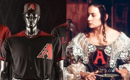 Forcing people to wear a big scarlet “A” has been done before, and it wasn’t exactly a point of pride for the wearer.
Something that could actually be a baseball problem: each uniform fits with just one of five different shoe designs. And since these unis will get sprinkled in all over the place, rather than each one being worn a few weeks at a time, that means in many (most?) games, D-backs players won’t be wearing the same footwear they wore in the previous game. Most of my shoes don’t fit perfectly, and I have no idea if that’s a big issue, but for a baseball player, playing in not-quite-well-fitting shoes would be like a race car driver racing in a seat a little too far away from the steering wheel. Maybe the team will make a special effort to fit all shoes well for all players (I’m not sure the players would necessarily speak up about this), and I hope so — the D-backs lost two position players to serious stress reactions in feet within just the last two seasons. That’s a lot of shoes to monitor, though.
Buck Showalter wouldn’t have allowed these kinds of shenanigans to affect on-field play.  Okay, maybe he would have…it’s not like shoes can shrink in the dryer. And while the D-backs may have the uniform alignment decided for every game next year already, just figuring that out will be one hell of a challenge; Lukas has some detail in his piece about which unis take which of the team’s 7 hats, and even with some of that information missing, it looks like the team may have 32 different uni/hat combinations to pick from.
We’ll get used to these uniforms just like we got used to the last ones, and it might be fun just to see something different. I have my eye on one of those teal-trimmed home jerseys, although the chances I buy or wear any of this snakeskin-design-adorned gear are pretty much nil. You have to hand it to the D-backs: they’re not afraid to experiment. But while there’s at least one Robbie Ray in there, this has the feel of the offseason a year ago, trying a whole bunch of new bodies and having them do new things all at once. Maybe it is an evolution, and as Lukas pointed out, new and strange can seem classic later, like the tequila sunrise Astros jersey. Evolution, though, doesn’t usually involve so many changes at once.
If you enjoyed this article, please consider sharing it!


2 Responses to Double Plus: A Committee of New Uniforms by Committee
Leave a Reply
@ryanpmorrison
 Best part of Peralta’s 108 mph fliner over the fence, IMHO: that he got that much leverage despite scooping it out… https://t.co/ivBrl76adF,
  RT @OutfieldGrass24: If you're bored of watching Patrick Corbin get dudes out, you can check out my latest for @TheAthleticAZ. https://t.co/k1DymgY7zO,
 - Of course, they may have overtaken the league lead for outs on the bases just now, also...
But in 2017, Arizona ha… https://t.co/38MBrr2D4b,
- Prior to the games today, there had only been 5 steals of 3rd this season (and no CS) in the National League. The… https://t.co/gVVL84vPQ5,
- RT @OutfieldGrass24: Patrick Corbin has a WPA of .318 and it's only the fifth inning.,
Powered by: Web Designers@outfieldgrass24
- Old friend alert https://t.co/xwSHU0F8Hn,
- Every once in a while you get a beer that's just a little off... Usually happens to me at airports.,
- If Pollock doesn’t sign with a team that wears red uniforms I’m going to be really disappointed. Working theory: Se… https://t.co/zHn9DqzEiD,
- The work here by @Britt_Ghiroli is splendid https://t.co/c8tSq0vw3T,
 RT @TheAthleticAZ: Plenty of #Dbacks fans gave it some time - and they still don't like the idea. The "why" from @ZHBuchanan
https://t.co/9oDlvue3fV,
RT @TheAthleticAZ: Plenty of #Dbacks fans gave it some time - and they still don't like the idea. The "why" from @ZHBuchanan
https://t.co/9oDlvue3fV,
Powered by: Web Designers

The D-Backs new uniforms still have one big problem, and it is the same problem since 2007.
The primary D-Backs color is red…
I’ll never support the red uniforms…
Why not? What if Greinke pitches in one?